Showing posts with label inktense pencils. Show all posts

Thursday, May 15, 2014

More fun combining Pyrography with Colour

Adding a Splash of Colour
12x12 inches
Pyrography, Inktense pencils & Coloured Pencil
on Cradled Birch Ply

The Intrepid Friendship
12x12 inches
Pyrography, coloured pencil and ink on
Cradled Birch Ply
Oh what fun I am having combining the pyrography with the coloured pencils and colour. I have had a wonderful pyrography artist me to alert me to the fact that pyrography can fade over time, which alarmed me quite a bit. The fading isn't consistent and can be unpredictable. This is one of the reasons that I am combining the coloured pencil with the woodburning. Apart from loving colour of course, I darken the darkest darks and brighten some areas, so that if there is any fading of the burned marks over time, the overall integrity of the image should be maintained. I just love the combination of texture and rustic look that the wood burning gives and even more so when combined with a bit of colour. I think I might be hooked :)

Thursday, May 9, 2013

I Love You, Mum - Kookaburras

I love You, Mum - Kookaburras
16.5 x 33 cm
Inktense pencils, coloured pencil and Pastel on Colourfix Suede
This is another illustration for the children's book entitled I Love You, Mum, due for publication by Hachette in 2014. I am using Colourfix Suede for these illustrations, which is a really versatile surface and is extremely receptive to a wide variety of media. As the Colourfix Suede is primarily heavyweight Watercolour Paper with the specially prepared primer applied, you can use water media without the fear of buckling and I find any wet media glides over the top, and because of the slight tooth, you get a very even application. The tooth on this surface is nowhere near as sandy or textured as the original Colourfix papers, so you can still get a high degree of detail, and yet also put down multiple layers. I have found most surfaces that allow for fine detail are quite limited in the number of coloured pencil layers they will accept and conversely the more textured surfaces which do allow for lots of layering are not so great for doing fine detail. 

Friday, July 13, 2012

Grandpa Elliott in Miniature

Grandpa Elliott in Miniature
3x4 inches
Coloured Pencils and Scratchbord tools on Scratchbord
This is the second time that I have taken the time to draw Grandpa Elliott's Portrait. I wanted to try out some scratchbord in miniature and combine it with coloured pencils and his wonderful beard and the highlights on the glasses seemed to lend themselves perfectly to scratchbord art. This artwork is for the upcoming Australian Society of Miniature Art exhibition and with entries due by the end of next week, I am rather ambitiously (or stupidly), hoping to get another one completed within that time frame.

Saturday, December 31, 2011

The Lady and The Prince - and a Happy New Year

The lady and The Prince

8x10 inches

Inktense Pencils and Faber Castell Pitt Pens on Acrylic Paper

Firstly, a very Happy New Year to everyone and I wish you all a year filled with good health, peace and happiness!!!

A very big thank you to Juno Kughler http://junokughler.com/, an amazing coloured pencil artist, who kindly shared some of her reference photos for other artists to use, including the one of this gorgeous frog.

Those of you who have followed my blog for a while, would know how much I love to experiment with different mediums. I have had my Faber Castell Pitt Pens for a while now and always suspected that they could be a joy to use, if used on the right surface, but hadn't really spent a lot of time exploring which ones would bring out their best qualities. Unfortunately, they really aren't suitable on drafting film at all, because even once the ink has been left to dry, it still wipes straight off the film. I would like to try the pens on the Dura-lar wet media drafting film to see if this gives the ink more staying power. I also found that regular paper seems to negate the wonderful blending qualities of the pitt pens as the ink dries a little too quickly for my liking.

I spent a lazy day last week pulling out all sorts of different surfaces to see how the pens responded and found that the acrylic paper was an absolute joy to work with. I would like to find a brand of acrylic paper that has slightly less texture (I'd be keen to hear if anyone could reccommend one). The one I'm using is the Canson, which has a texture similar to linen canvas.

I actually started this drawing using the inktense pencils and was only using the Pitt pens for the darker areas, but then found that I could achieve a combination of textures and shades, by either layering the pitt pens over the top of each other, using a wet brush to blend the ink before it dried, or softening edges and blending colours using the Tria blending marker.

I must admit I feel really excited about exploring this combination of mediums further. The colours are vivid and bright, but it is also possible to achieve soft, muted colours. I would love to hear of anyone else's experiences with these pens, and in particular different surfaces that you might have tried :)

Thursday, June 30, 2011

Finding the Key to Happiness

Finding the Key to Happiness


24x28 inches


Ink and Dry Media on Polyester Canvas


The human pursuit of happiness has always fascinated me and each of us has our own path to find that elusive key. This artwork barely touches on all the different ways we individually try to search for that inner peace and joy.


I am eternally grateful to my wonderful husband Stephen, for encouraging me and supporting me in my own pursuit of happiness, when we both know how much better off we would be financially if I went out and earned a salary. He has given me the greatest gift of all - happiness (xxx - for Step)


Monday, June 20, 2011

Please Don't Go - a change of media

Please Don't Go

8x11 inches

Ballpoint pen, micron pen and Inktense pencils

on Polyester canvas


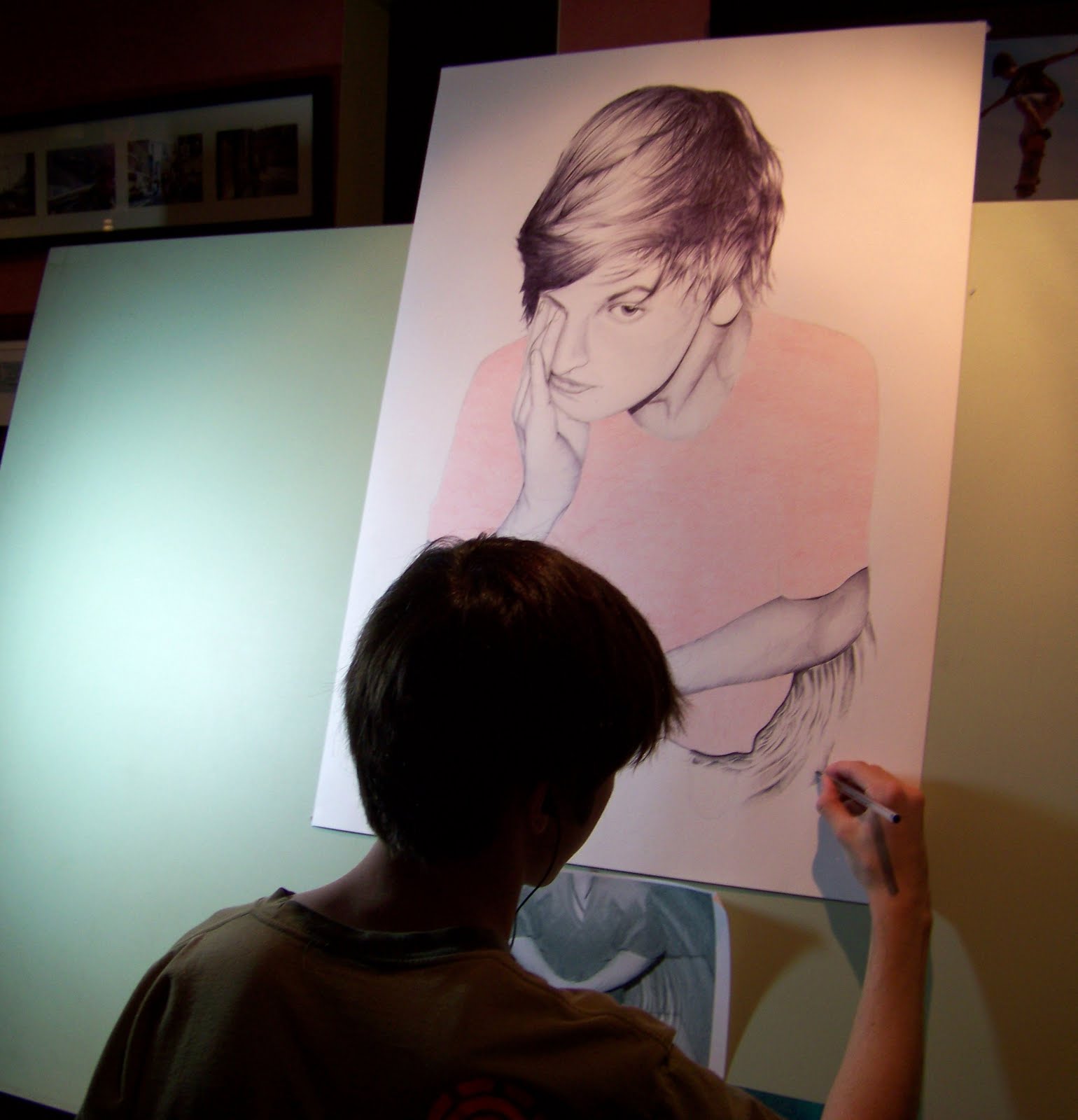
Recently I received an email from one of my friends with a photo of her son's HSC art assignment. I was fascinated to find that the majority of the self portrait had been done with biro, or ballpoint pen and this inspired me to do some research and experimentation in the use of ballpoint pen as a serious medium for use in art. There are quite a few artists now who used the ballpoint pen in their artwork, one of them most notably is Juan Francisco Casas who creates huge photorealistic artworks in blue bic pens. Another artist Allan Barbeau spent 96 hours doing an amazing reproduction of the Mona Lisa using only ballpoint pen.


Mostly I have tried to use ballpoint pens with an ISO 12757-2 rating because this ink is the most archival, but I also used bic pens for some of the finer work. Working with the ballpoint pen gave a mixed sense of satisfaction with the way lovely gradients of shading could be achieved from soft right through to deep and dark, but also some angst, as there really is no room for error, so in that way, it is quite an unforgiving medium. For now though, I am hooked and for my next artwork, am aiming to work on a bigger canvas, so will probably need to post progress shots.